Interview with our Head of Design, László KÁLMÁN, about the latest design trends, perspectives, popular colors, and fonts. We were curious about what will be trendy this year in terms of digital products’ look&feel, so we caught up with our design expert.
LNX Blog: In every January the Pantone Color Institute defines 1 or 2 main colors of the current year. Multiple industries are following these trends. Do you think that 2021’s colors, the illuminating yellow and the ultimate grey, will influence this year’s UI/UX trends or the design of a website and mobile apps?
The Pantone won’t define trends in terms of digital design, they will indicate colors, but not trends. Of course, the Pantone colors are industry standards, even in web design. They define colour trends for 21 years now (see the full colour palette of the last 20 years here), starting from prints, graphic design, etc. so they are the most creditable institute to do so.
Not sure though, how much this will influence the actual web and mobile app designs in 2021. It depends in which direction this whole thing will go, to a very colorful design trend or maybe to something with more cleaner lines.
At the beginning of the 2000’, there were gradients and more realistic graphic elements, then the flat colors become more popular, after a few years we slowly went in the direction of pastel colors, monochrome designs. And most surprisingly, in the last 1-2 years the energizing, fresh colors became more and more popular. So, to summarize this, trends define colors, but also their tones. Product design, marketing and similar industries will follow these tones. I guess we will know for sure in 1 year if these 2 colors, the illuminating yellow and the ultimate grey, were indeed the colors of 2021.
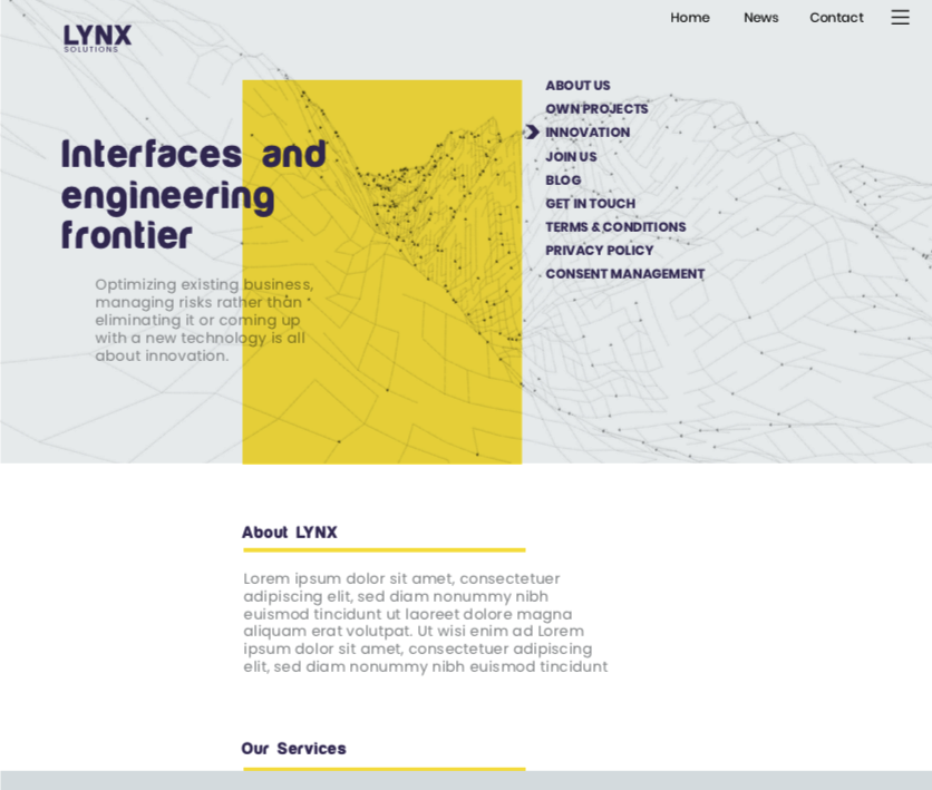
Simulation with yellow and grey, the color trends for 2021
LNX Blog: Is the rumor true that retro fonts are very popular nowadays?
Yes, it is. In the last 1-2 years, retro fonts were very popular, especially on presentation websites, or on retro products, for example on vinyl records. This is not something that popped out in 2021, usually, these kinds of things are more like a process. Even if something is a short-term design trend, still it will be for 4-5 months. Nothing comes and goes fast in terms of design trends.
LNX Blog: Can you give us a few examples?
Glass Morphism, this UI element is meant to blur the background to give a transparent glassy look to something. Or in 2020 was very popular the Neumorphism UI trend, this is a combo of flat design and Skeuomorphism. Neumorphism is often called soft UI, due to the combination style of background colors, gradients, shapes, highlights, and shadows. The buttons and selectors achieve a soft, almost 3D styling. This is the Google Material UI’s evolution of combining white and grey elements using beige background shades, the purpose is to highlight elements without using hard edges. The aim is to get smooth, rounded edges.
Another very popular trend is the dark mode. This can be relaxing for the eyes, so it is one of the reasons why it got so popular. With the time passing, it became easier to achieve the dark mode effect, it’s much easier than before to implement something like this in the current browsers, especially if we want to switch between light and dark mode. Nowadays almost every mobile app has a dark mode function, according to accessibility best practices, this is the way to go.
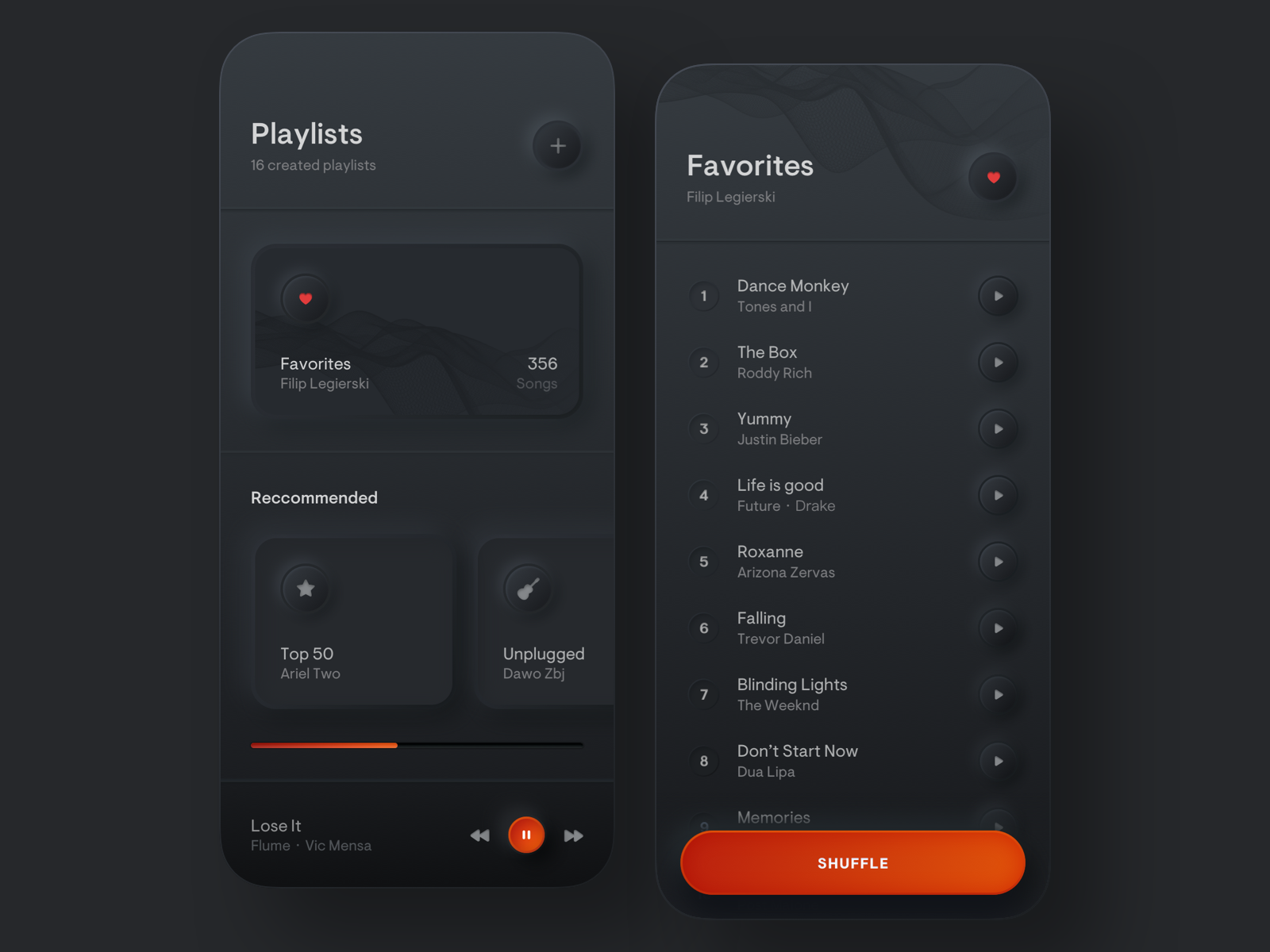
Photo source: D4U. Take a look at their inspirational gallery of Neumorphism.
LNX Blog: What about the parallax animation/scrolling? Is this a current trend?
Yes, this is coming back. It is not something freshly discovered, it’s been popular in the past. The parallax is more about the dynamic movement of an element by its speed or by scrolling up and down, keeping the background at a slower rate.
There are also dynamic parallaxes, of course, it depends on the implementation, but the final result can be “wowish’. Regardless if we are talking about vertical or horizontal parallaxes.
LNX Blog: Studies are showing that by using scrolling and 3D elements on a digital product, it becomes more interactive for the users and keeps them staying more on the website or in the mobile app. Is it all about users being more present on the digital product?
This is mostly related to the UX. If you are using animations or micro-interactions on your website (clicks, progress bars, dynamic texts, background animations), basically you are creating a story for the user. The big brands are following this trend, for ex. Apple with almost everything they do, or the new Samsung Galaxy S21 Ultra phones presentation website. So, if you visit their websites, you will have the impression that this “story” was created especially for you. It is much easier to imagine how would you use that product or phone.
Or take a look on the Netflix website, where you can set your navigation panel, you are the one who decides how to intake their content. The batch of 6 movies recommendation is not irrelevant either, as the human brain can take up to 6 things to percept it in the most optimal way. 6 on the desktop and fewer movies on smaller screens, but the tendency is the same.

Simulation of parallax effect on a possible website design
LNX Blog: The pandemic situation locked all of us in our homes. We spend MUCH more time in front of the PC or mobile device than ever before. We do shopping, we read the news, we socialize online. Do you think that this fact influenced companies to optimize their digital platform to keep even more their users on the website?
Yes, this made them rethink the whole thing. Facebook, Instagram, Netflix, all use AI and algorithms to provide you customized content based on your searches, interest, etc. This is one of their big „touché” of keeping the users more and more on their platforms, they push hard on this.
Working from home made us use more online tools or web-based tools, these even became industry standard for us, for ex. Figma, AdobeXD, Sketch (mostly leader in the Mac community), + Marker, Zeplin, Trello, Miro, Reetro, Zoom. Now the old fashion meetings are replaced by life collaboration tools used by the same group of people, having meeting notes, sticky notes, and strategies defined into the tool itself, accessible for the entire team.
The VR stuffs and Augmented Reality will become more and more popular this year, for the same reason of getting an even more realistic effect in front of your PC. A huge break through is the new Live View Beta Google Maps navigation combined with street view.
LNX Blog: Tell me about it! Just look at the Oprah-Obama interview on Apple Tv from November 2020. What a fantastic technology they achieved there, so cool, so realistic that the two of them are sitting in different rooms, being in different cities and still having the conversation at the same fireplace.
LNX Blog: Thank you László for your time!
Related Articles
What is TEDx? Due to its popularity in recent years, we think everybody knows what a TED Talk is and what it is about. To do a short recap, TED…
Planting trees for a better tomorrow For many decades, tree removal has been identified as one of the primary causes of nature loss and environmental harm. Over 20 million…
Last year we started the blogging with a strong article about plans for 2020 without suspecting how the year will turn out. Looking back now, the article seems ambitious, optimistic,…

